
When I first started working at a corporate gig many (15) years ago, contrast fails would get you a talkin’ to by your team leader. Contrast fails are common, but easily avoidable. Even some of the top world dominating brands commit this design mistake from time to time. I also see the mistake on billboards and various types of signage throughout every day life. I’ve expressed concern about contrast fails in many creative meetings at work, and it gets pushed to the side as a non-issue and ultimately becomes a joke, which irritates me. Not everyone has spring chicken eyes, so consider your demographic before and after designing!
What mistake is it, you ask? The mistake of not keeping every possible user in mind when you design your ad, sign, website, app, product, or whatever message you are trying to communicate. If someone can’t read or interpret your message from a fair distance, what good is it? Old folks have some money to spend too, so make sure they can read your ad! That sounds like common sense, but I just don’t know anymore. Just because you’re a 25 year old designer with all the latest “modern” trends in your playbook doesn’t mean 64 year old Tera from accounting will be able to effectively read your message. Design is all about communicating a message effectively and tastefully at the same time, and you want people to get your message… right?
How is anyone supposed to read that from several feet away?
It seems even the person on the side of the street holding a cardboard sign begging for help needs art direction for their ad, or I mean, sign. If your dirty 16×9″ cardboard sign has 25 words written on it in tiny and horrible writing with an ink-less ballpoint pen, how is anyone supposed to read that from several feet away? On the other hand, if you somehow manage to find a black sharpie marker and make a nice bold font with a quick 2-3 syllable message, it’d be much easier to read your sign and process your message. That’s how you get real attention with your sign!
Anecdotal marketing evidence

For example, I adopted a puppy one time. She ended up having 11 puppies of her own. I raised them for a while and then had to find homes for them. My previous paragraph proved to be a winning marketing tactic to get rid of the surplus of puppies I had available. I ended up finding all of them a home by standing out in a busy public place with my handmade cardboard sign that simply said, “FREE PUPPIES,” in bold filled black sharpie marker stencil-like, Impact-like, font. Basically, everyone could easily read this sign from a good 50 feet away and that helped me find homes for my puppies in a quick afternoon’s work. I guess the puppies practically sold themselves because they were so dang cute, but the marketing strategy was sound! Don’t believe me? Just look at the photo of the cute little bastards!
Contrast fails in real life!
The first example of IRL contrast fails are in Apple iOS text messaging.
The colors fail contrast tests, but are still quite legible on my iPhone displays. I’m not quite elderly yet, so I imagine the default colors could be difficult to read for elderly folk. Apple offers plenty of accessibility adjustments to remedy this contrast fail, which is pretty awesome, but is your average 75 year old going to know how to access the 5-level deep nested menus to find the adjustment toggle? No offense, but I doubt it.
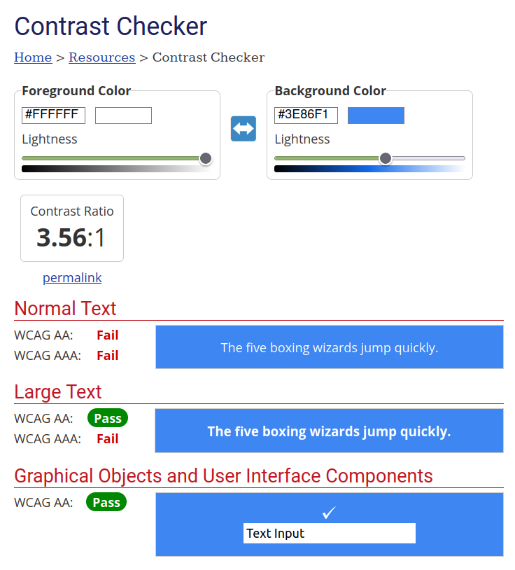
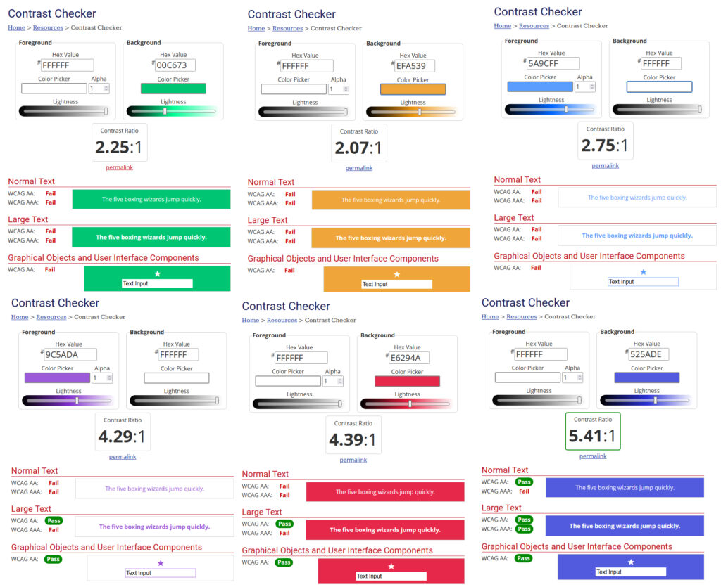
Default out of the box iOS font sizing and colors are not so good for elderly users or people with vision impairment. Check out the WebAIM: Contrast Checker to experiment with different color contrasts. I used the sweet Firefox color dropper to sample some iOS text message screenshots I found on Brave Search.
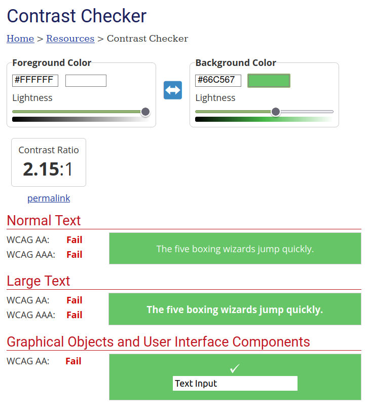
iOS Blue #3e86f1 and iOS Green #64c365 with white text. These both fail the contrast checker, and the style factor is not too great in my opinion. It looks alright on my iPhone, however, it could be difficult to read for a large portion of users.
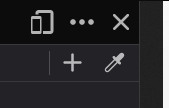
Yee haw! Look, ma! No Photoshop color dropper required! I sampled these colors using Firefox v117.0.1’s built in color dropper tool. No more color dropper add-on extension is required with Firefox on Linux Mint Cinnamon! Rejoice, because this update applies to other OS as well. Hit F12 for developer tools and then look for the dropper icon near the top of the pane splitter (below the X), then sample some colors! The color dropper even zooms in on the pixels of the page when you hover over colors. Now that is top notch!
Another contrast fail example I saw on a local college billboard
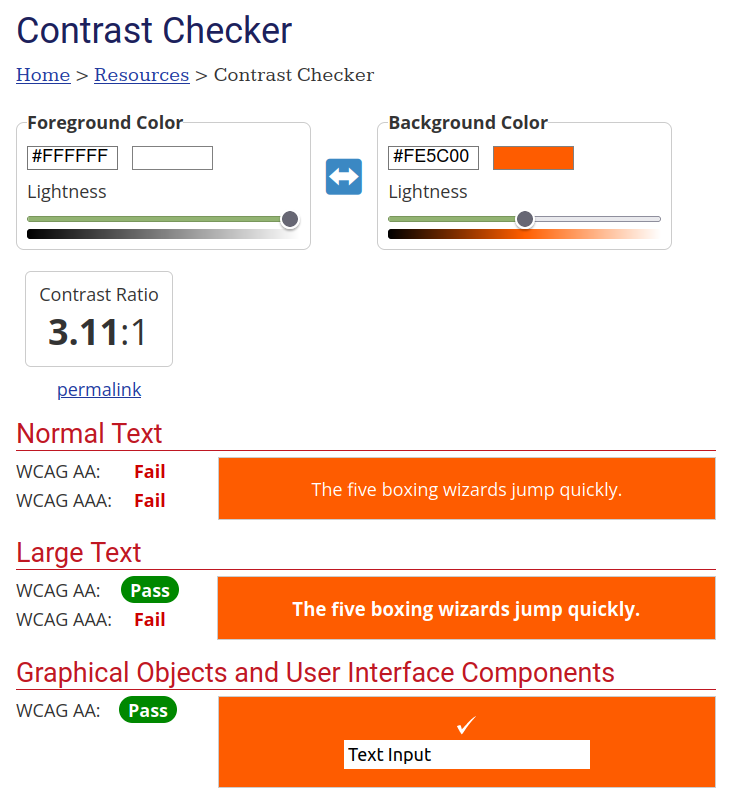
As a matter of fact, below is the link to the ad I’m talking about. You can see the thinly stroked white text on the vibrant orange background, which is the main fail here. The bold text looks fine, but from a far distance on a highway driving 75 MPH, the thinly stroked white text, the main selling point of the ad, becomes nearly illegible unless you have perfect youngster LASIK-tier vision. Orange might actually be the answer, but I’m not too sure about the effectiveness of their billboard ad.
https://news.okstate.edu/magazines/state-magazine/articles/2021/winter/new_slogan_promotes_osus_land-grant_mission_public_impact_research.htmlLink: New slogan promotes OSU’s land-grant mission, public impact research: https://news.okstate.edu/magazines/state-magazine/articles/2021/winter/new_slogan_promotes_osus_land-grant_mission_public_impact_research.html | Archive Link: https://archive.ph/u9fw7
As I was going 75 MPH on the highway, I could barely read the main text on this billboard, even though it was an Impact-like bold font. The text on the billboard was a pure white outline and the background was Oklahoma Cowboys orange signature color, which is a fairly vibrant orange. Needless to say, the contrast is a pure fail! I always laughed when I drove by this billboard on the 44 toll road. Someone paid big money for that HUGE contrast fail. LOL. I wonder what’s up with the art direction here?
Now, OSU’s website has dark text on some parts and white text on others. Large bold filled white text would be acceptable, but smaller white text or stroked outlined text on the vibrant orange background is a contrast fail. I’m kind of surprised the accessibility department over there hasn’t figured this out yet. Perhaps the accessibility department doesn’t communicate with the billboard branding art department. I’m not hating on their branding because I love orange, but I’m just saying dark text on top of the orange would be better and more visible for a larger user-base.
Until I find more contrast fail examples…
Always be sure to use a contrast checker when you are designing stuff for all media. Your message needs to be communicated effectively and you can’t do that if some people can’t read the message due to something as simple as a contrast fail. Now, if you really want to be safe, you can look into color blindness checks as well. Just because Ana, the 21 year old spring chicken intern designer, can see white text on a neon background, that doesn’t mean Darryl, the 53 year old MS-DOS veteran in accounting, will be able to read it easily.
Be sure to bookmark the link below for quick access or consider adopting another contrast checking strategy for your projects.
WebAIM Contrast checker: https://webaim.org/resources/contrastchecker/
Other contrast fail examples
I’ll post the contrast fails I find here…
Contrast fail: MSN (Microsoft) news page dark mode link fail
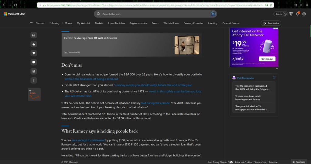
Hey MSN, I found a contrast fail on your website! I came across this article today on December 31, 2023. For something you want people to click and continue reading, you should definitely not make these links hard to read. We chill in dark mode to ease our eyes, not strain them on your hard-to-read blue on black links. This ain’t a Kenny Wayne Shepherd song, it’s a web article, and blue on black is hard to read in this case. Your dark mode color scheme is a fail!
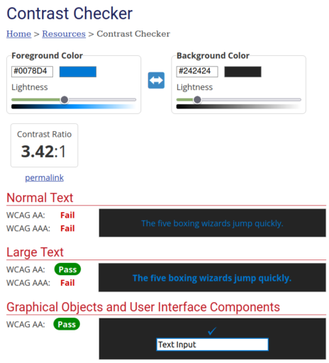
To fix this, Microsoft should, at minimum, bold the links on their page and change the blue to one of their primary logo colors such as the yellow. However, to see Microsoft venture this far from the norm would probably equate to pigs flying and hell on earth. The light blue (#0078D4) link text on a dark gray (#242424) background is contrast a fail! Consider changing the links to a much lighter contrast.
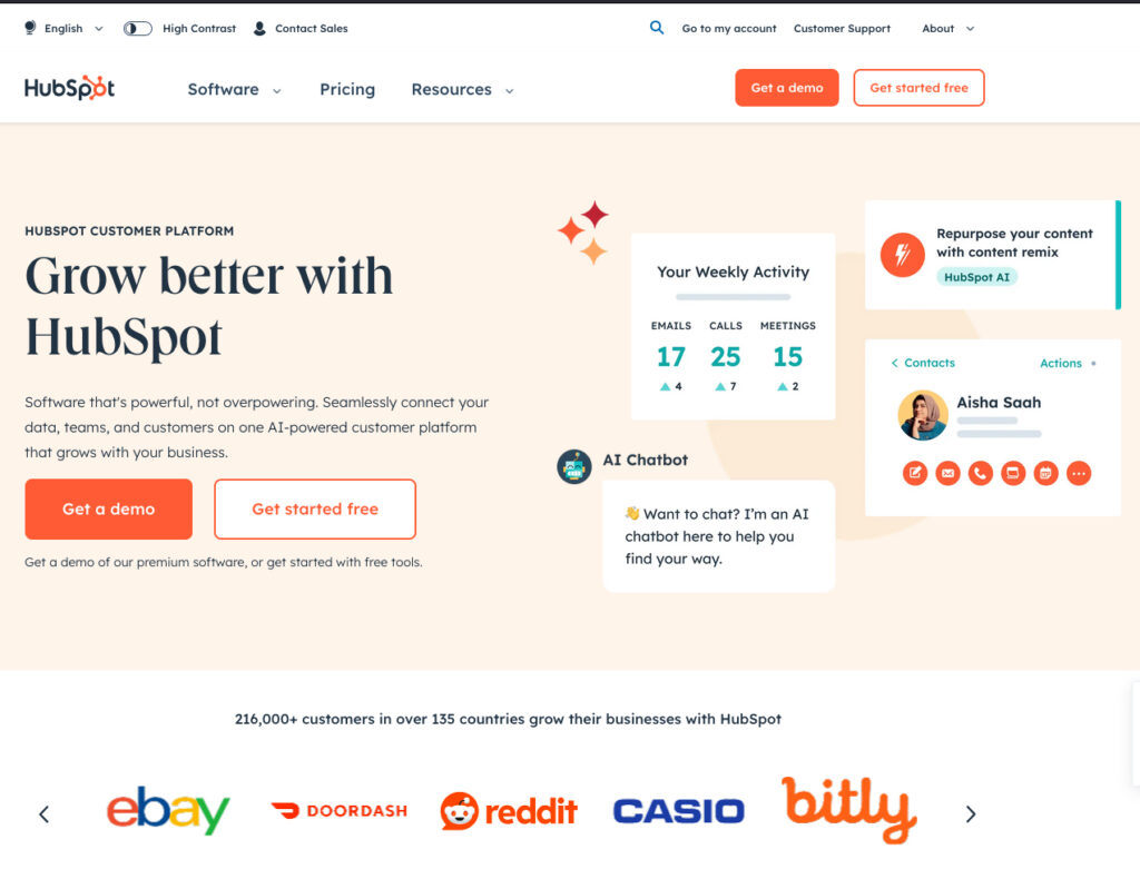
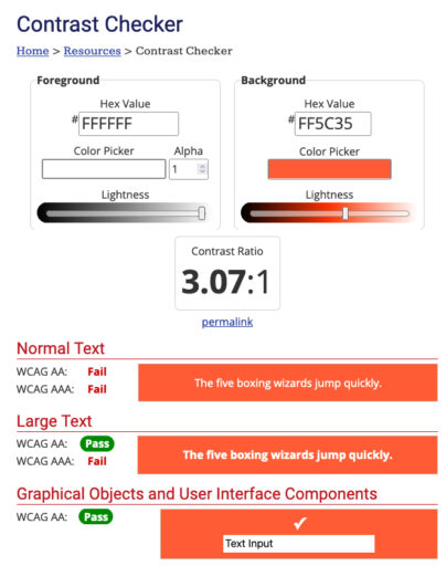
Contrast fail: Hubspot’s CTA buttons, bright orange on white
One of the biggest marketing platforms in the world, that I’m being forced to use lately due to my knack of “figuring things out,” is Hubspot. This platform is a beast of its own and that goes without saying. I’m not really a fan, but I digress.
I can’t believe they have a huge contrast fail such as this. Sure, they offer an easy to miss “high contrast” toggle switch at the very top of their website, but the toggle switch doesn’t apply to the rest of their web platform when you’re logged in and working on projects. I run f.lux blue light eliminator on all of my screens in the mornings and evenings when I’m working on the computer, so this orange on white color scheme is very poor when it comes to accessibility. Hubspot’s color scheme only passes for large text, which is declared as about 18 pixels or greater, according to WebAIM.
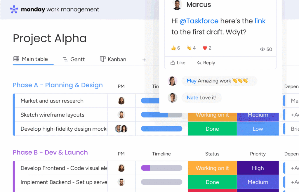
Contrast fail: Monday.com children’s coloring book scheme
Monday.com has contrast fails on their task status bars which are perhaps the most important parts of the dashboard. This is the first place one would look when they open the web app and it’s a fail. I recently got to experience Monday.com’s contrast fails due to a workplace shift. We’re no longer using Asana and got forced over to Monday.
Whatever. 🙄
I don’t really like either one of them, but so far I’d prefer Asana over Monday, any day of the week 😐.
Just look at these glaring contrast fails. Even on the Monday dark mode theme, the contrast fails still persist. I’ll most likely end up writing some custom CSS mods for Monday due to these poorly selected contrast-failing colors for task statuses. We’re not in kindergarten anymore, we don’t need cutesy bright fluorescent colors to decipher tabular data. I’d much rather prefer Asana’s task list in comparison to Monday’s.
What a dumb name that is for a project manager – Monday. No one likes Mondays. No one.
This screenshot is from the Monday.com home page. Let’s analyze the multiple contrast fails here.


Leave a Reply